Our New Look for 2022
Posted in Blog, rooflite News on December 30, 2021
It’s hard to believe it’s been almost 17 years since we founded Skyland USA, the parent company of rooflite, our green roof soil product line. During that time, many things have changed.
We’ve grown internally from a tiny team to a larger team. Our blender network has expanded nationally and internationally. We’ve provided soil for countless green roof projects in the U.S., Canada, Mexico, Chile, and Australia. We’ve developed new products and systems to better meet the needs of our industry and clients. It’s been a truly transformational 17 years.
What hasn’t changed during that time is how we present our company. Since the very beginning, we’ve had the same logo for Skyland USA and our rooflite product line. It’s time for an update so that our brand better reflects our offerings and our growth in the last 17 years.
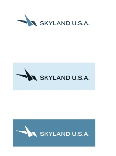
Skyland USA Logo
Skyland USA is the parent company of rooflite, but it’s not necessarily a brand that most people in our industry know or see. We want to change that by giving Skyland USA its own distinctive and recognizable brand, separate and apart from rooflite.
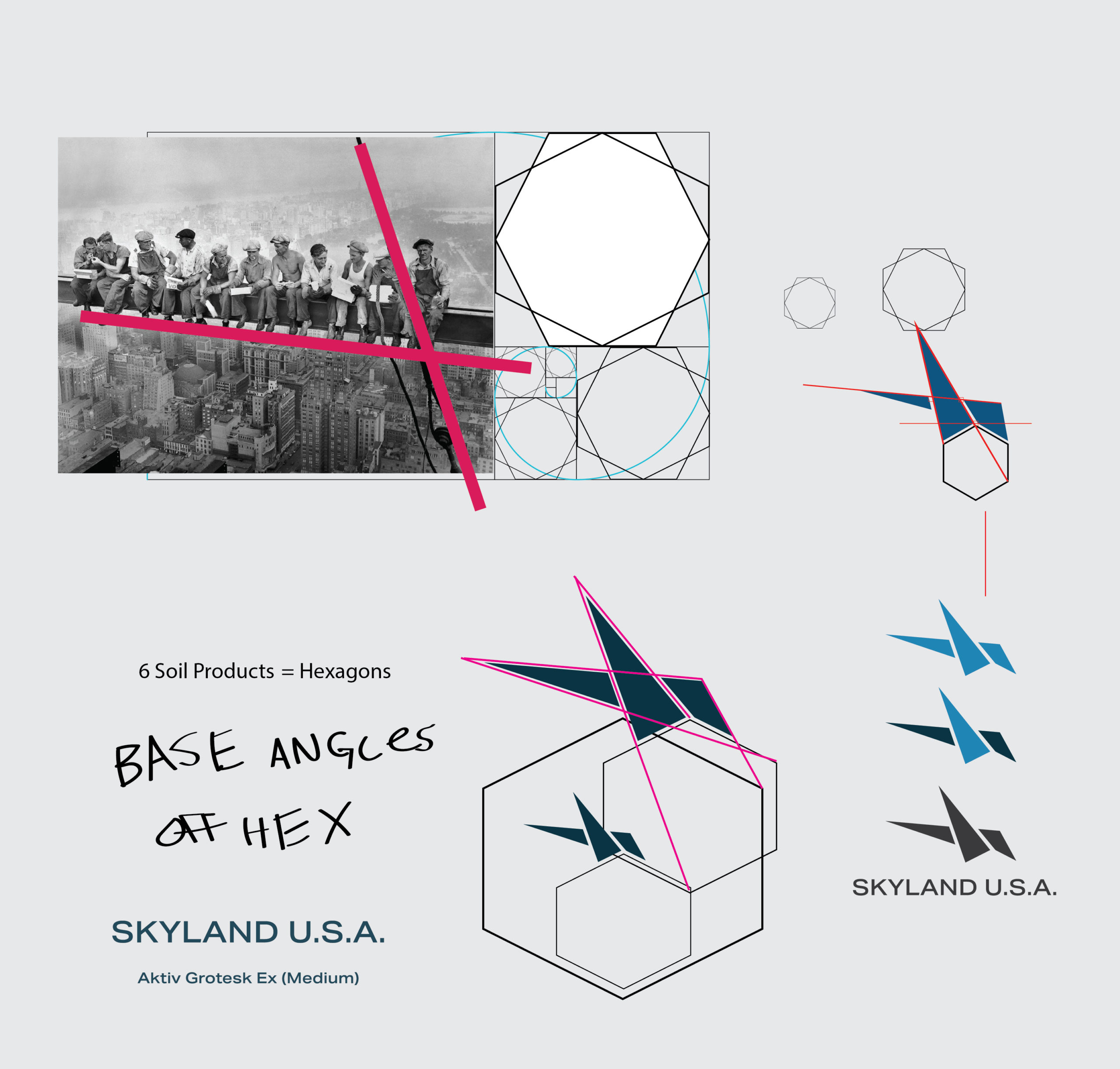
Our original Skyland USA logo was an attempt to represent what we do. Soil for green roofs. As we’ve grown, though, it doesn’t feel like it truly captures the view of the future that our products and company represent, so it’s time for a change.
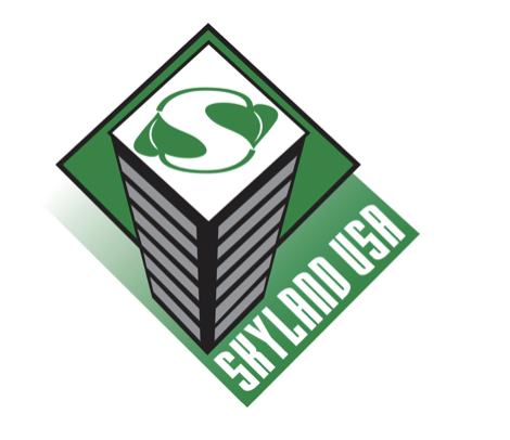
The starting point for the new logo was how green roofs are changing cities. This got us thinking about another era of change for cities. The birth of skyscrapers. The futuristic technology of mass produced steel beams combined with the ingenuity of architects, construction workers, and citizens created the cities we know and love today.
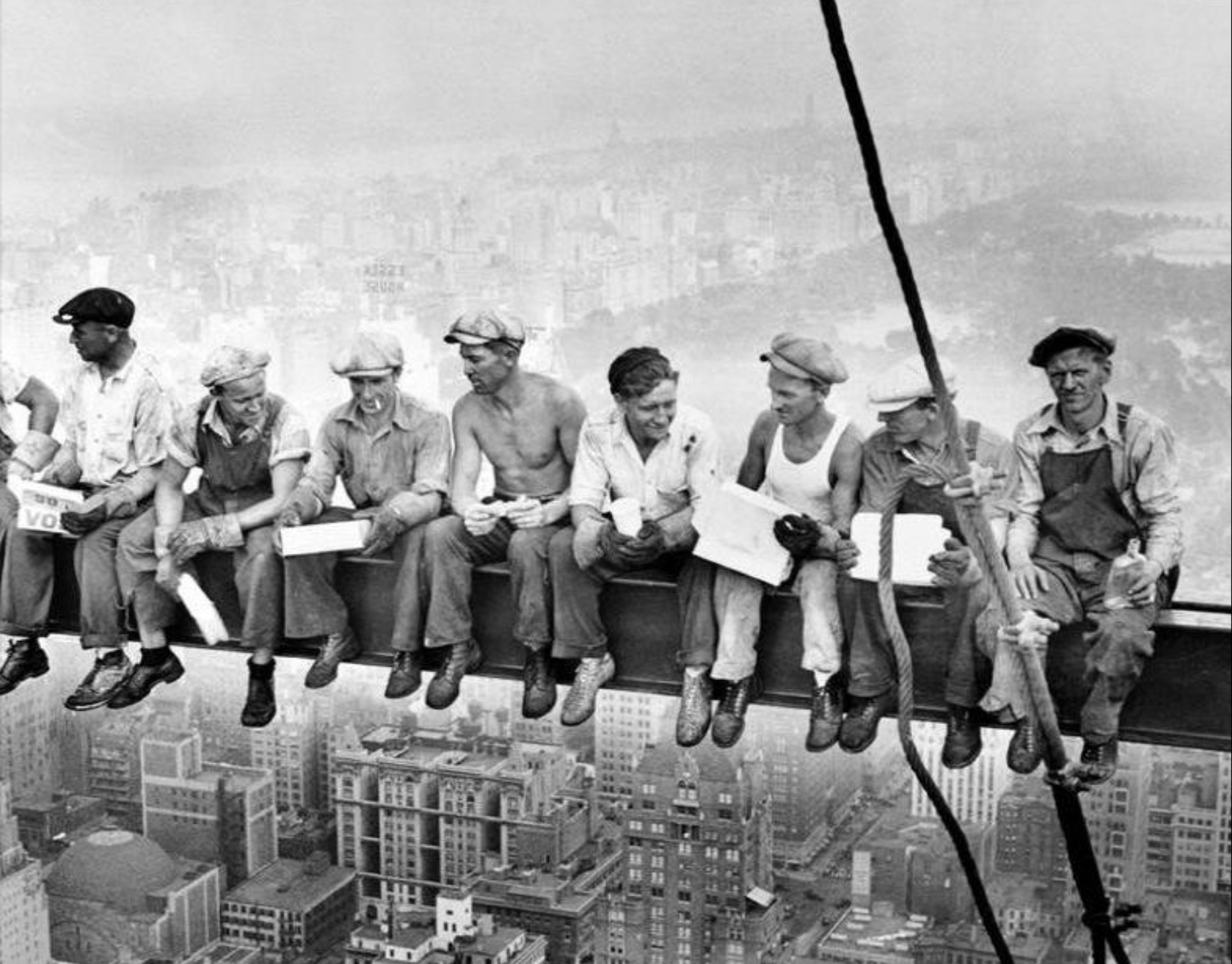
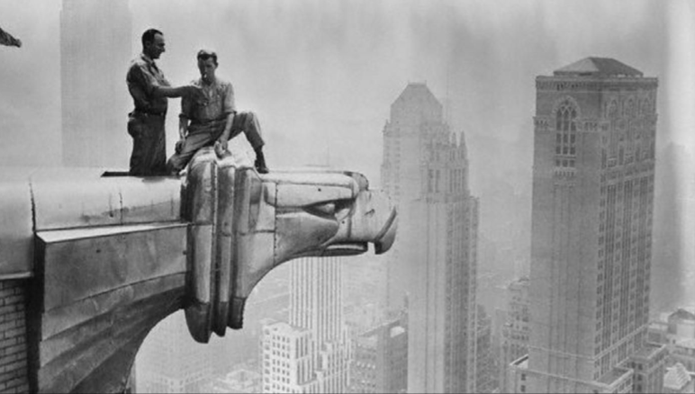
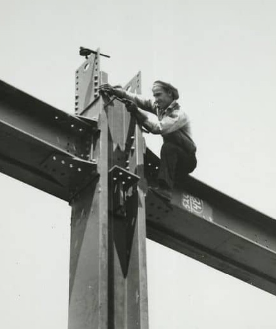
These once cutting-edge buildings are still with us. They are intertwined with modern life, even if they were built more than 100 years ago. People still live in them, work in them, and have memorable and important moments in them. These buildings have evolved and changed over the years, but they will always be a lasting, iconic legacy of a bygone era.
At Skyland, we are building a legacy too. A legacy that involves some of these very same iconic buildings. There is an important synergy between the skyscraper era and the green roof era. Innovation in building, materials, and people. Creativity in application, design, and delivery. Quality in approach, process, and outcomes.
Our new Skyland USA logo pays tribute to the skyscraper era but updates it for the green roof era. The logo we settled on combines elements that reflect what we do.
So what’s new? Well, everything.
The color. Our products normally live in the sky, and we wanted a color palette that reflects that. We also wanted a distinct set of colors for Skyland USA.
The icon. The new icon is an abstract representation of construction, angles on skyscrapers, nature, birds, the sky, and people and nature together. It feels forward-looking and soaring.
The font. This font complements the angles on the icon with a curvier feel. Nature rarely works in precise, straight lines, and the font captures that idea.
rooflite Logo
Our original rooflite logo is very special to us. It was the result of a lot of collaboration on our team, and we felt that it reflected our brand perfectly from the leaf to the font to the tag line.
We still love it, but we felt that it was time to update it to be more modern as we look to the future in this innovative industry.
The changes are subtle but important. So what’s different?
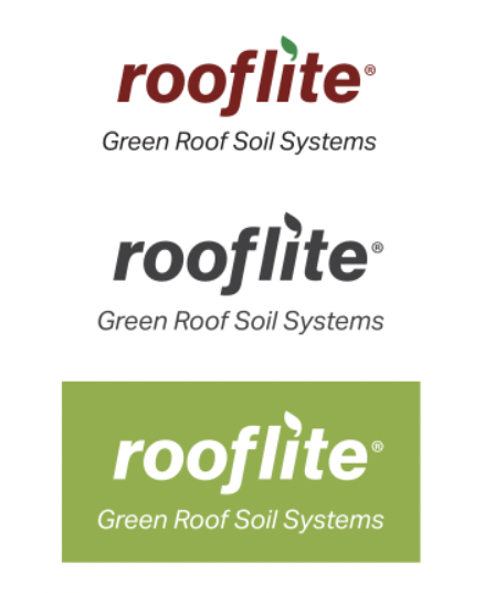
The color. The red and green colors have been slightly adjusted to make them easier to read.
The leaf icon. The icon is more abstract with less detail. This change leaves the distinct impression of a leaf but also holds up when the logo is viewed at a small scale.
The font. The font is now thicker with with no serifs, letting our name stand out a little more boldly. Our tag line of “Certified Green Roof Media” is no longer in bold. The contrast between our name and tag line makes both easier to read.
Looking Forward
The process of creating and choosing our new logos wasn’t easy. It’s a challenge to change things you’ve seen every day over 17 years and to objectively assess how our company should look to the world.
In the end, though, these new logos really capture what we are these days. Modern, natural, forward-looking, and innovative. We look forward to continuing to grow with our industry, our clients, and our team.